Design Strategy Studio,Est. 2011
State of Rhode Island
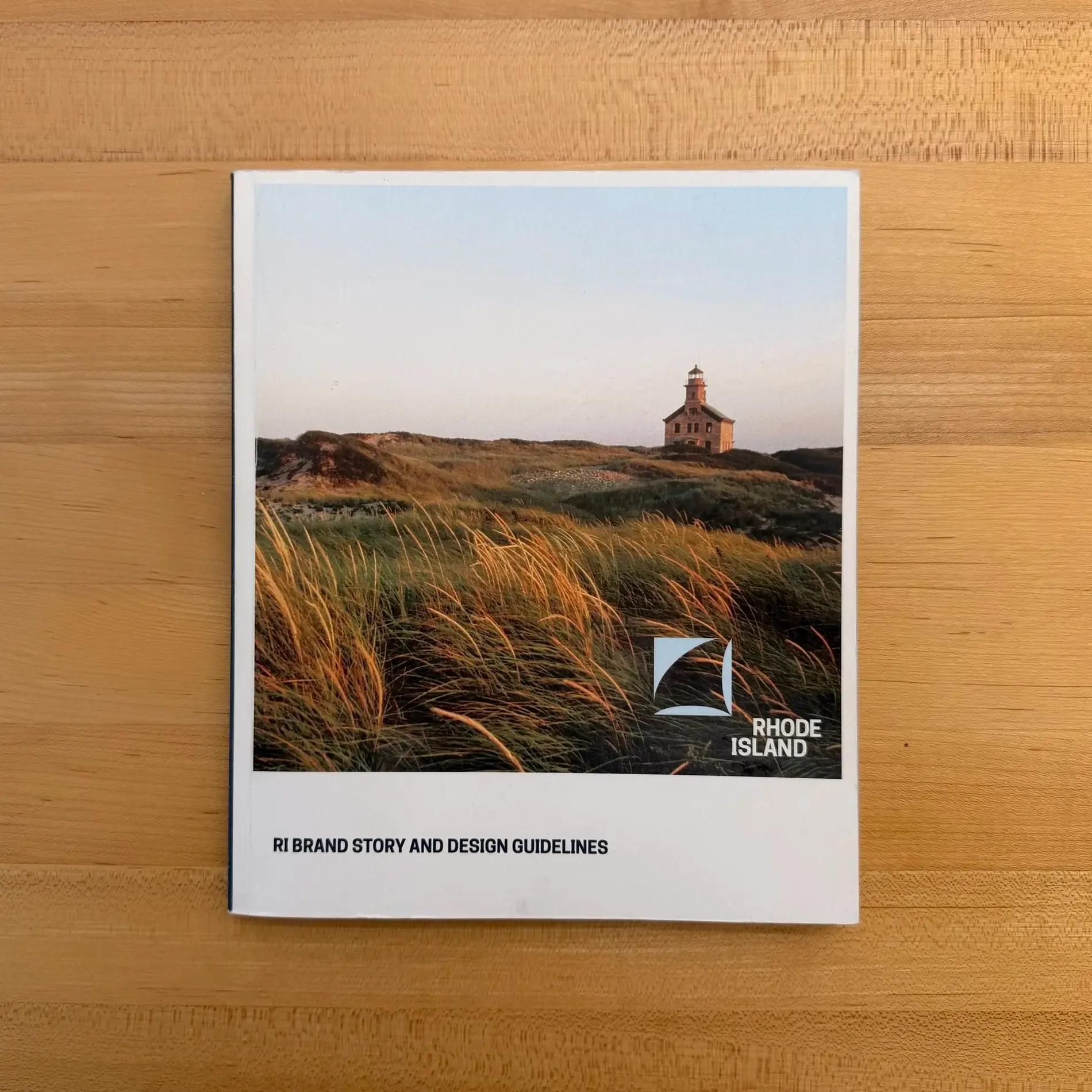
How might a state recover from a rollout the public rejected — and build a visual system people actually recognize as theirs?
The State of Rhode Island had rolled out a logo and a slogan. It did not go well. What followed was the kind of public reaction that makes an organization want to go quiet.
We did the opposite. Before designing anything, we ran a series of public events — bringing Rhode Islanders into the conversation about how their state represents itself.
The real problem
The rollout had produced a logo and a slogan. That was all it had produced. There was no system underneath — no typography, no color discipline, no rules for how any of it behaved across the enormous range of things a state actually communicates.
A mark without a system is not an identity. It’s a single artifact that has to carry weight it was never built for, and it fails in public.
What we made
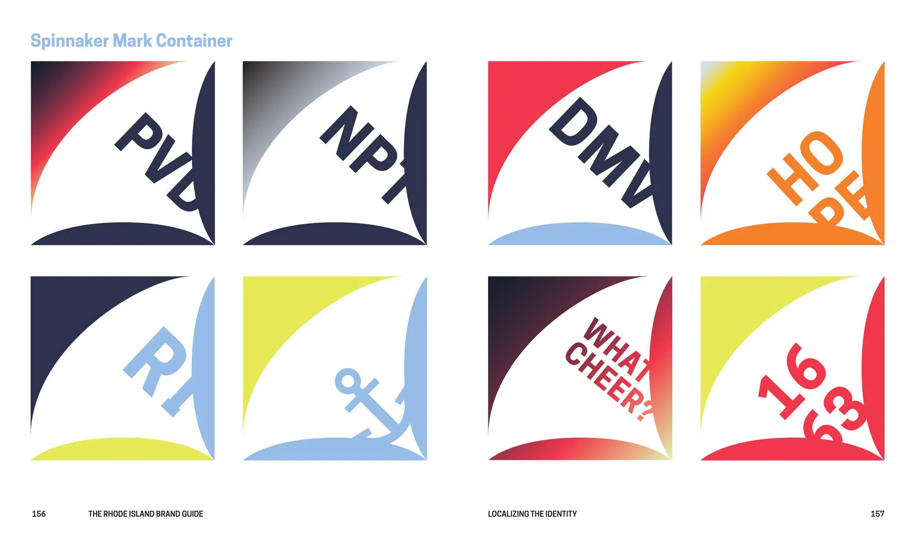
An entire visual system where there had only been a logo: typography, color, layout, and the standards that let agencies and departments make good decisions without calling anyone.
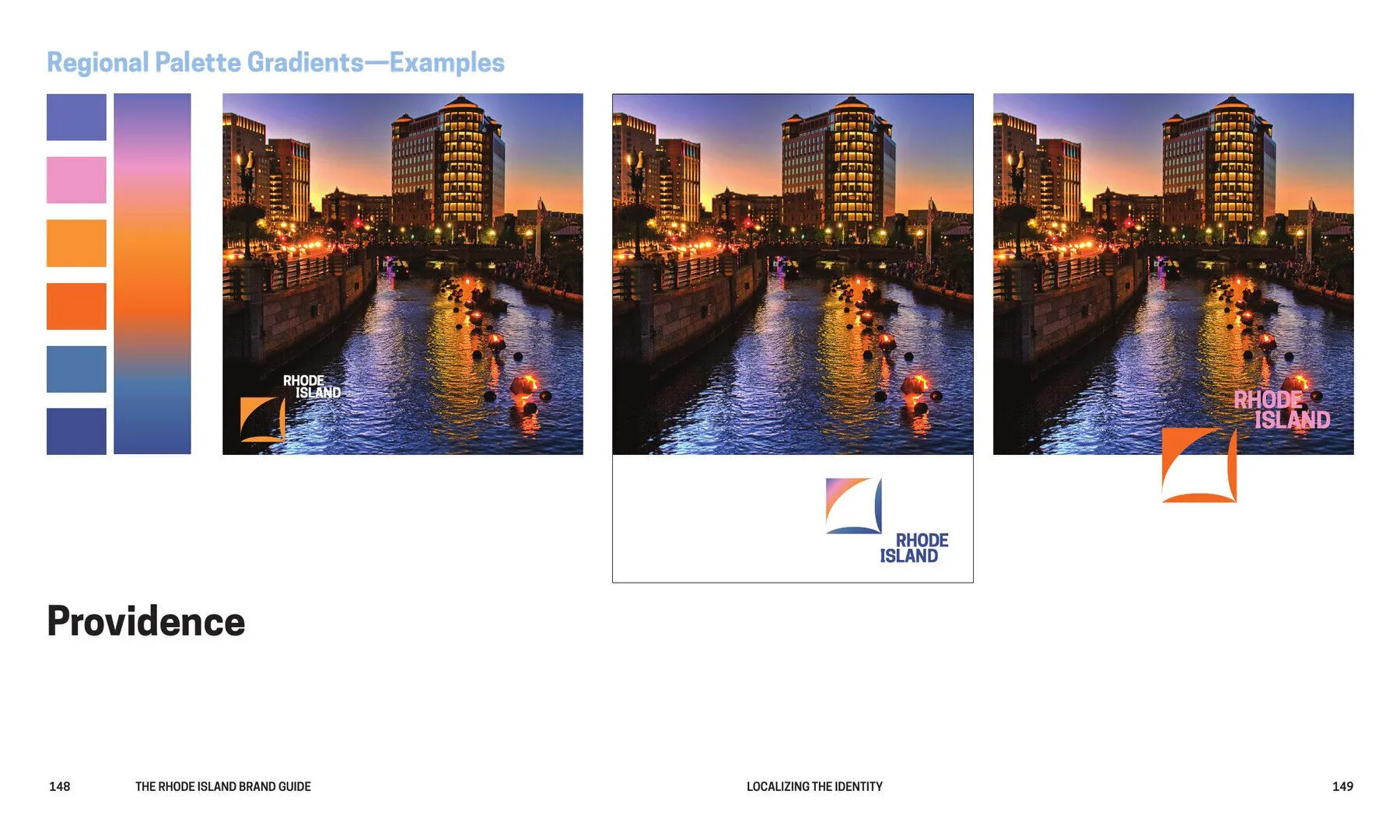
The state’s own team ran it from there. They used it to update the website, the tourism guide, the social profiles, and the materials that follow from those.
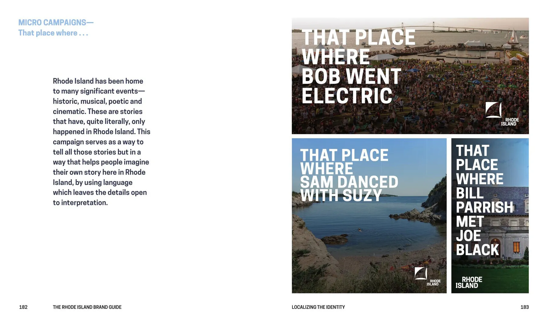
We also made a digital ad campaign out of residents’ own photographs and the places they recommended. It raised traffic to the tourism site.